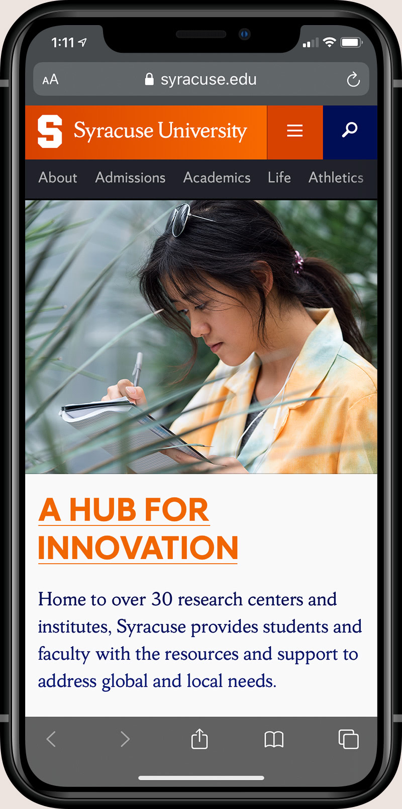
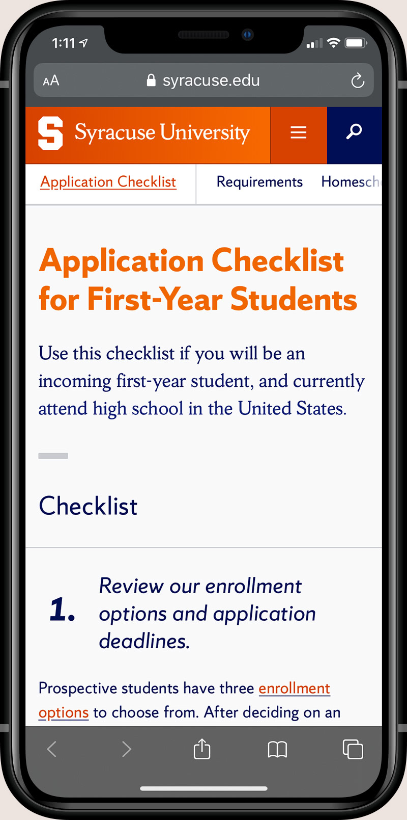
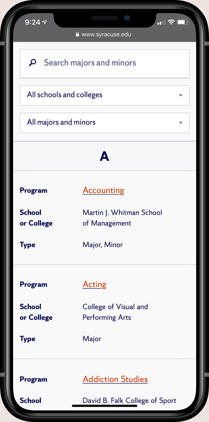
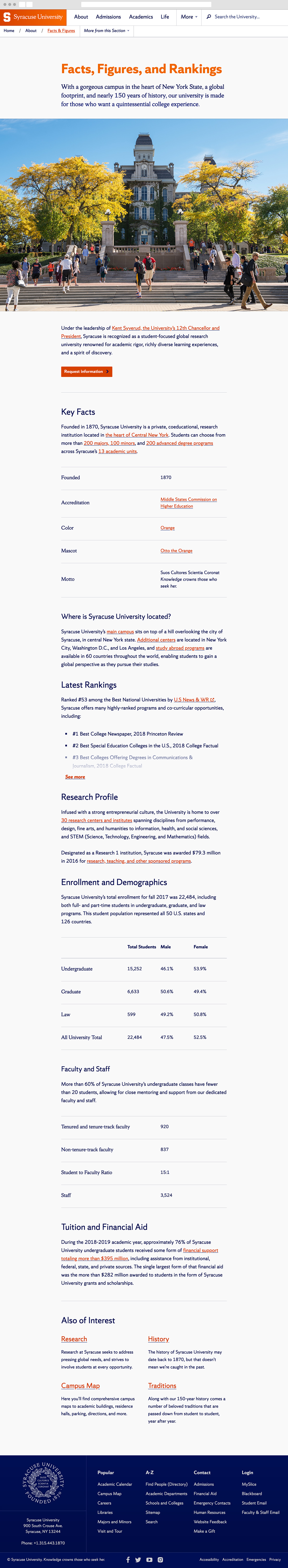
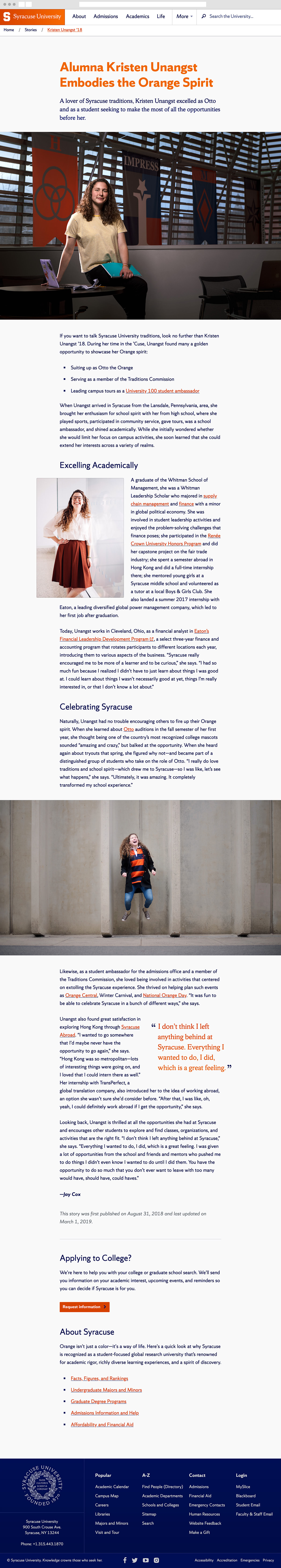
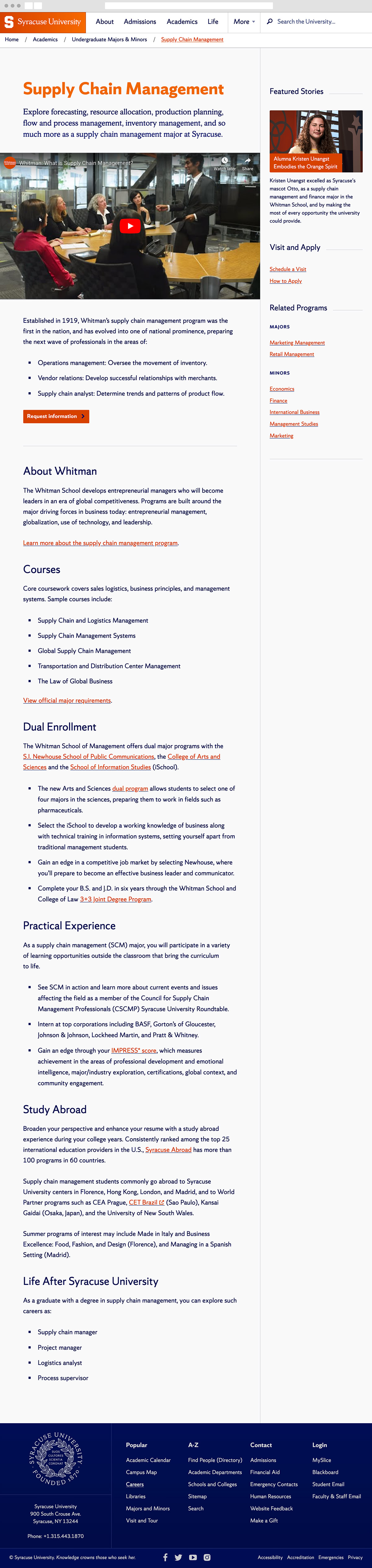
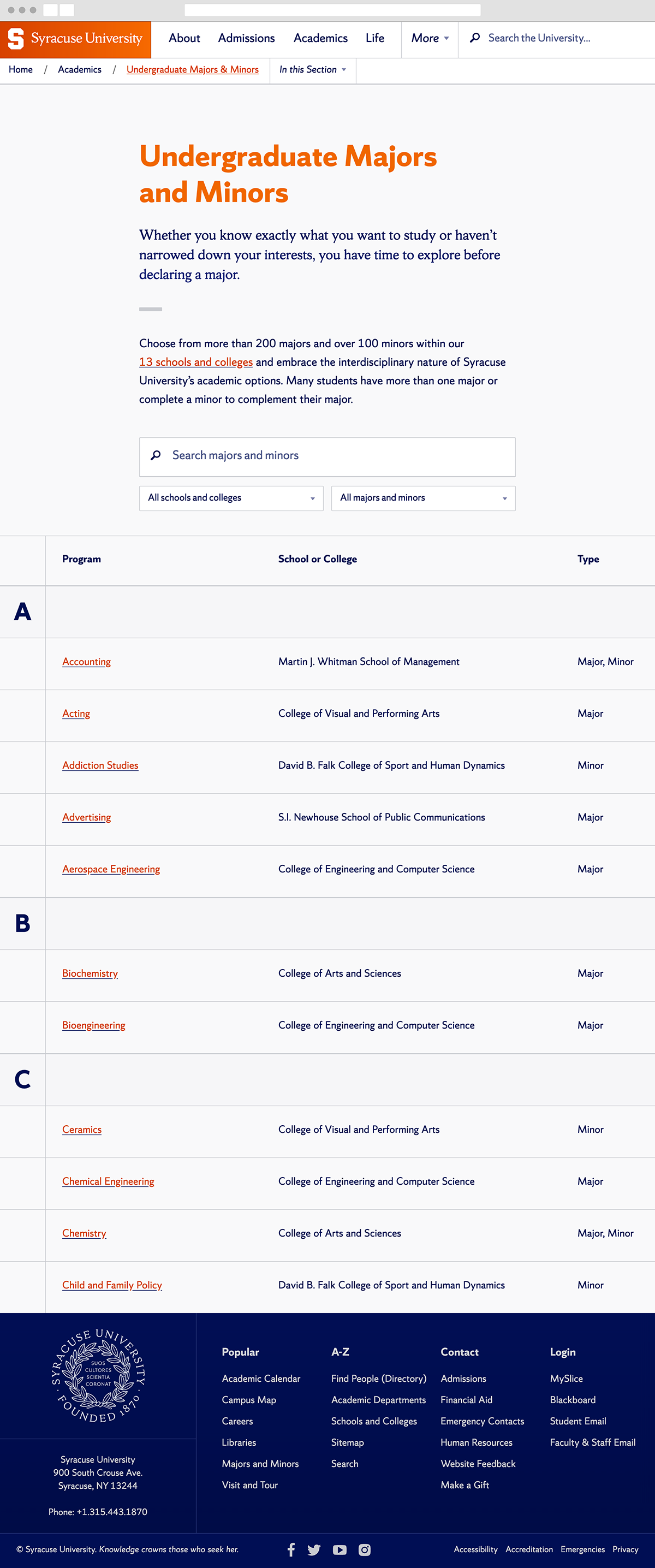
Syracuse.edu

UI & UX Design

In 2016, after seven years since the previous site launched, my team set out to redesign the University’s flagship website, Syracuse.edu. The existing site was in rough shape: it lacked focus and a primary audience, it wasn’t accessible, and it pre-dated the advent of mobile computing and responsive design. In the convening years, its content had also become obsolete as internal stakeholders, like the Admissions office, shifted their efforts toward more-modern, albeit siloed, standalone sites.

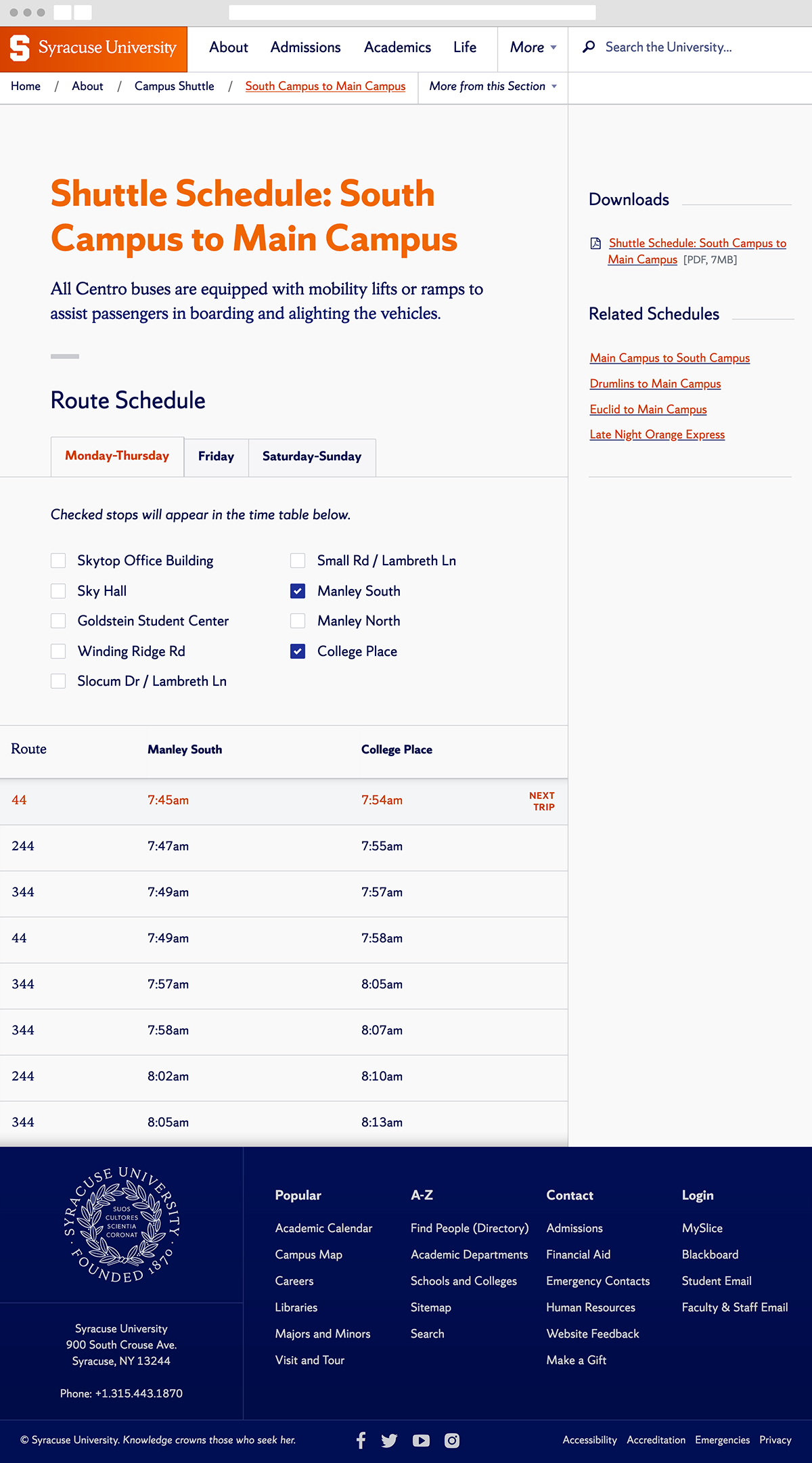
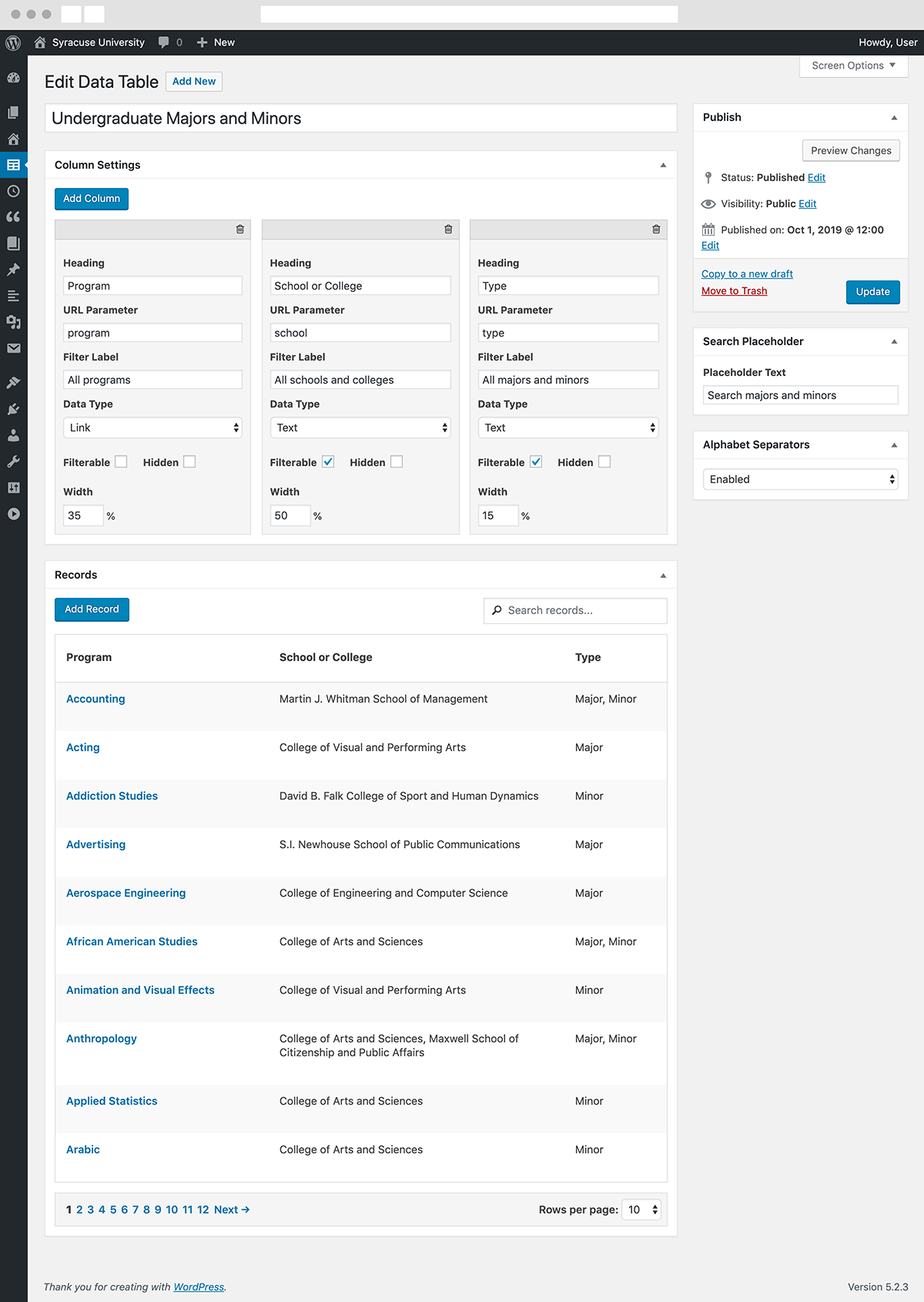
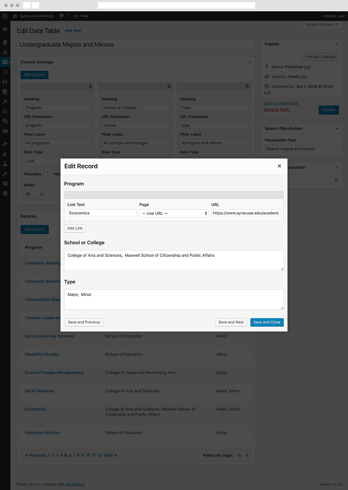
We re-built the site from the ground up to provide clear and detailed admissions information along with rich editorial content for students, their parents, and their families. We also consolidated numerous standalone sites along the way, removing content duplication and streamlining the user experience of browsing our web presence. The new site is fast, accessible, and mobile-friendly. It has also seen a record number of prospective student applicants in the years since its launch.

Contents

  1. Pages on mobile
  2. Interior page
  3. Editorial and major pages
  4. Data table pages
  5. Admin panel
User-interface components were designed and tested on small- and large-screen devices in tandem to ensure that even the most complex information was usable and useful across a variety of browsers and input methods.
Unlike some modern University sites, which function as a superficial ‘brochure’ and directory of standalone sites, our goal was to consolidate, standardize, and curate content from disparate sources into one holistic website. Detailed, search-optimized pages like this one were assembled to answer common questions from our prospective audience.
In collaboration with our Information Architect, I proposed and executed a design and content strategy that married funtional page content with editorial post content. Student stories added richness and authenticity to our academic majors pages while providing inbound marketing opportunities and increased organic search traffic.
In addition to being mobile-friendly (see above), we reduced the complexity of tabular data by allowing users to search, filter, and hide extraneous information to reduce cognitive load.
I also designed a variety of custom user-inface components for the site's admin panel to streamline the editing experience for content managers.
Go to Homepage